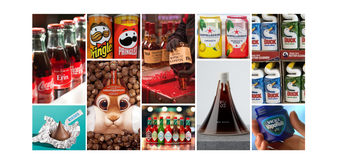
Distinctive Packaging Inspiration
Distinctive Packaging Inspiration
Distinctive packaging can not only make or break the success of a brand, but it also acts as brand growth multiplier. Get it right and it can drastically improve the chances of success. It grabs attention on shelf to help get picked up, it jumps out within advertising to be noticed, and it stands out at home to refresh memory structures. This all works together in a glorious synergy with a compounding effect to help grow the brand.
Here are some examples of best in class distinctive packaging, some iconic and well known, others just stand out pieces of design in their category.
Maker’s Mark
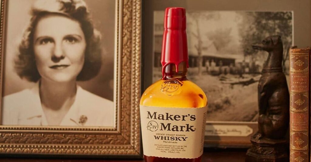
Margie Samuels, founder and the marketing genius of Maker’s Mark was way ahead of her time when she added the detail of the red wax top in the 1950’s. In the world of marketing science we would definitely call this a Distinctive Brand Asset, however Margie was just doing what intuitively made sense, making her bottle stand out against the plethora of competition. Even today the wax top is still dipped & added by hand. Maker’s Mark are also a great example of how to carry a DBA across the range, a challenge a lot of brands struggle with.
Vicks VapoRub
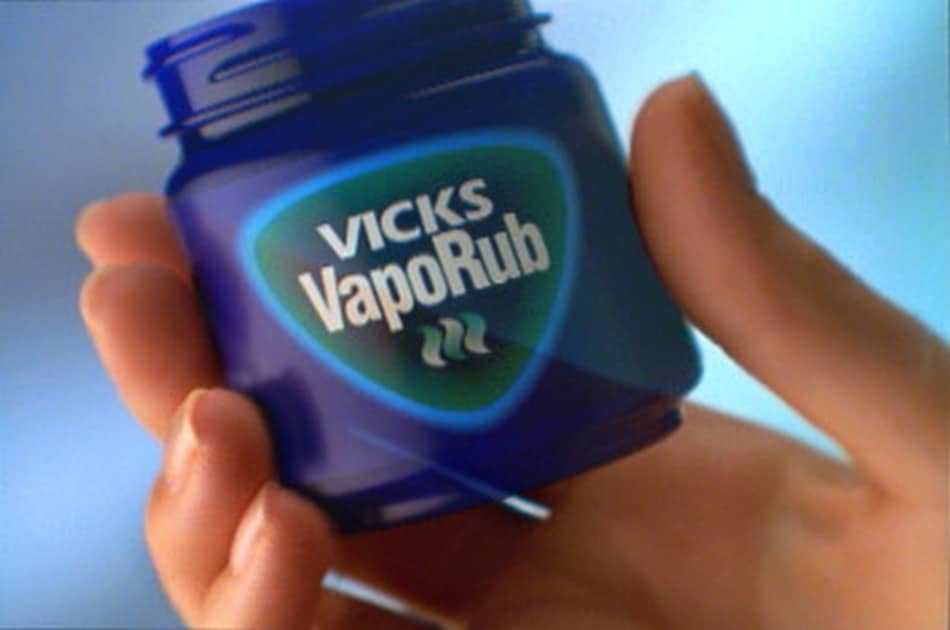
Originally named “Vicks Magic Croup Salve,” Vicks VapoRub gained popularity for its soothing properties during the early 1900s flu epidemic.
Over the years since, both the name and the distinctive packaging have undergone transformations. The initial glass jar transitioned into the now-familiar blue plastic tub with a green lid. Additionally, the logo has been redesigned to mirror the original throat lozenges from the brand, a design that is prominently featured in their advertisements.
Vicks serves as an example of a product-centric brand that strategically updated its branding to better align with its broader product portfolio, emphasizing a thoughtful evolution rather than change for change’s sake (a trend we see all too often).
Tabasco
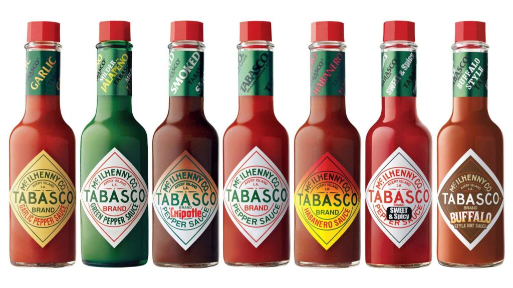
Is there a more iconic condiment pack than Tabasco? That little bottle of fiery goodness which is found in restaurants all over the world. The bottle is still modelled after the cologne-style bottles used for the first batch of sauce, the consistency with moderate evolution over the years is a thing of beauty.
Kikkoman Soy Sauce
In his 20s, he won the soy sauce contract from Kikkoman. “It took three years and 100 prototypes to come up with a final design for his dispenser, which combined a curving form with a dripless spout. More than 300 million of the bottles have been sold.” https://t.co/gp5O6R03ju pic.twitter.com/Gjo4iJeTSB
— Kevin McGillivray (@kev_mcg) August 4, 2020
“Design is a source of life enhancement” so said Kenji Ekuan, designer of Kikkoman Soy Sauce. As well as becoming something of an icon in the product design world for its timeless shape and dripless spout, its distinctive pack has helped make Kikkoman an incredibly salient brand for anyone purchasing soy sauce.
Hershey’s Kisses
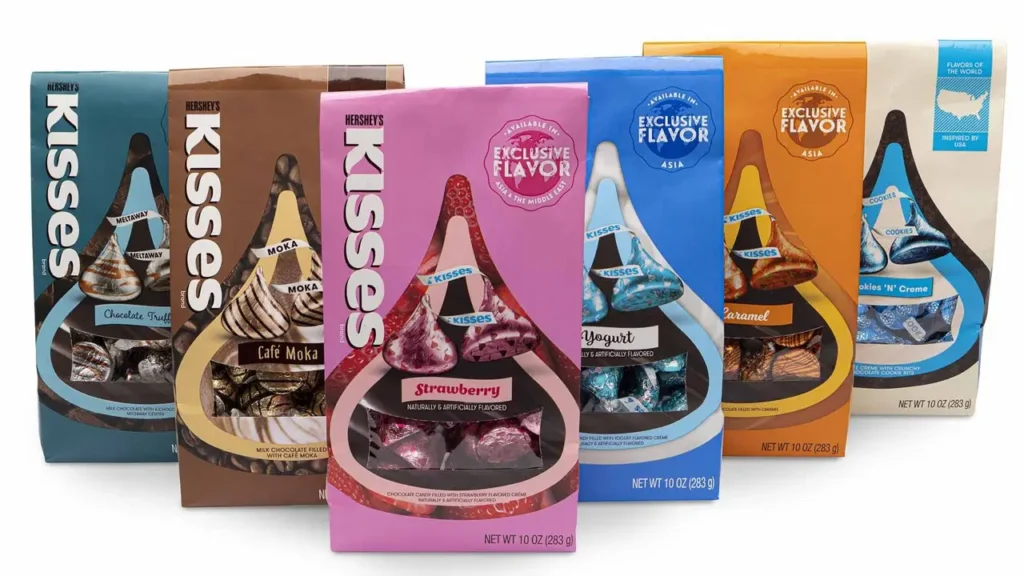
Hershey’s Kisses capitalize on a distinctive product shape and extend this to their wider packaging. The repetition of this unique droplet shape becomes a hallmark of effective packaging, fostering instant Asset Recognition in the confectionery aisle. Use of material is also notable, with foil encasing the chocolate and a paper tag housing the brand logo.
Hendrick’s Gin
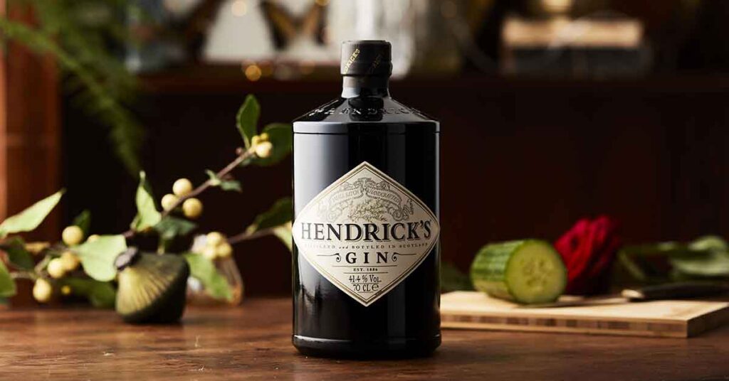
The bottle that launched a thousand gins, Hendrick’s Gin is well on the way to becoming one of the iconic bottles in the world of spirits. Rumour has it that the bottle performed poorly in initial research, with a strong split between those who loved and hated it. Luckily the brand team saw this polarisation as a positive, and the rest is history.
Duck
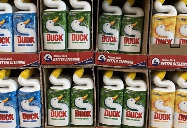
The Duck bottle shape marries design and function, and the brand has tripled down on this hard working asset – aligning brand name, packaging and brand character. They also provide s great example of a unified range, with consistency across SKUs.
Distinctive Asset Measurement: Brand Research That Provokes Action

Used by some of the world’s most distinctive & leading brands


The Kraken
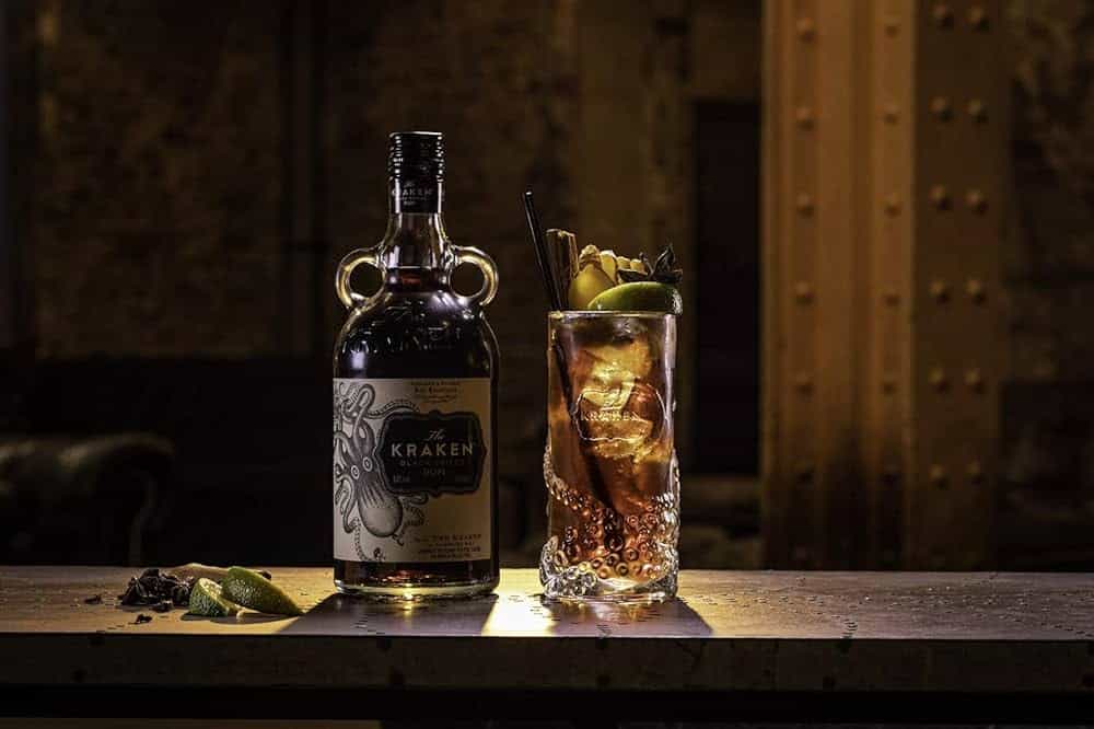
A great example of pack shape & brand icon working together. The bottle harps back to a bottle of ye olde, standing out from others in the category. I’m sure the innovation team behind the bottle had to stand their ground when justifying the complexity & additional costs the holder brought, many a distinctive element has been lost to this battle with creativity losing out to rationale short term commercial thinking. The real magic of the brand however is in their use of a kraken across all channels, it is such a flexible asset that can be used in many ways. The perfect example of brand doubling down and playing with their DBA.
Festina
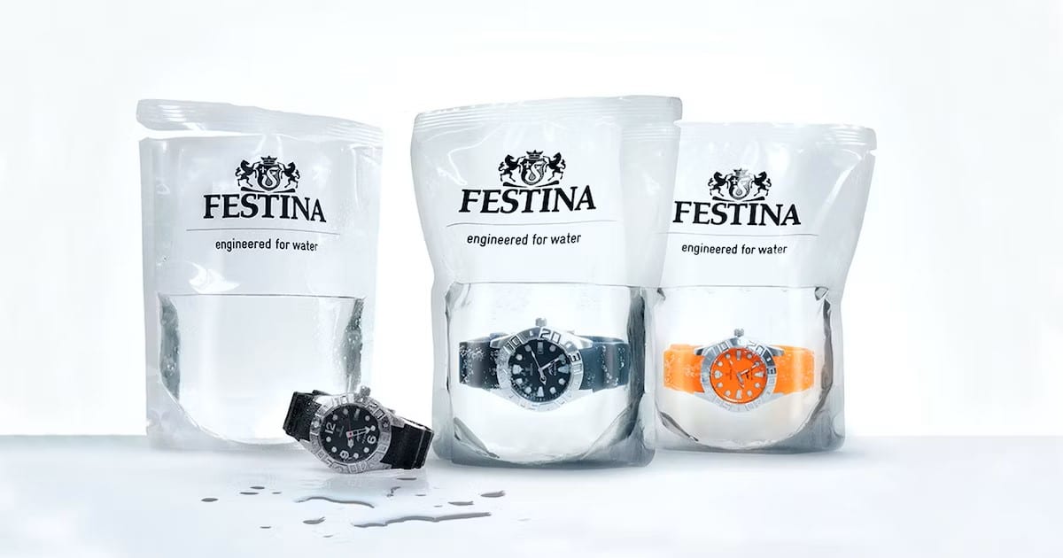
Merging a distinctive pack with a product truth was how Festina stood out to help sell their “diving” watch, submerging their watch in water within retail.
Fuji Soy Sauce
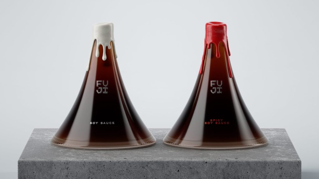
We thought Kikkoman Soy Sauce was distinctive until we saw this concept design from Jane Kudrinskaya. A beautiful design for a premium soy sauce brand.
Farma Pafylida
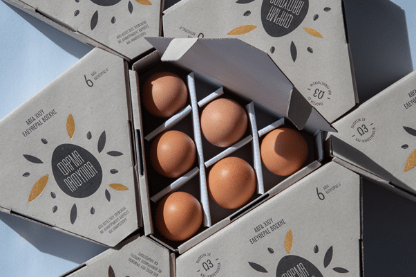
Superb example from Greek egg brand Farma Pafylida which looks very different from any other egg carton you see on supermarket aisles around the world. A perfect example of standing out from your category competitors by going against the grain whilst still feeling somewhat familiar to the category, make the familiar unfamiliar!
San Pellegrino
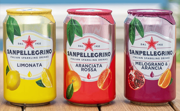
The San Pellegrino label was one of the best examples out there of how a small(ish) tweak is able to make a product so vanilla as a drink can become distinctive. Several stories over the years lay claim to the reason, whether that be the foil signifying the peeling back of an orange, or helping to save the can from the hot Mediterranean sun – however the most logical explanation perhaps being it just protects the can top while offering a level of premium-ness (to go along with the price point). In any case, it was a masterstroke. However, in recent years the brand, for whatever reason, have removed this foil top and realigned the can. Time will tell if this was a smart move or not.
Cook Home
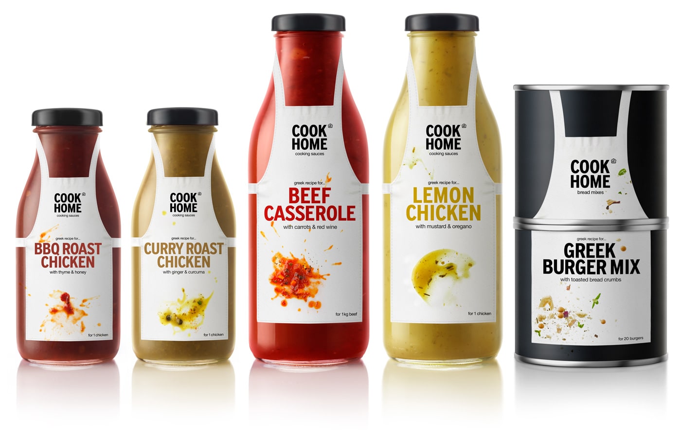
Wonderful design from Cook Home sauces by design agency mousegraphics. We love the way they used a common element but made it their own to help stand out on shelf, not to mention the consistency across the range.
Innocent Drinks
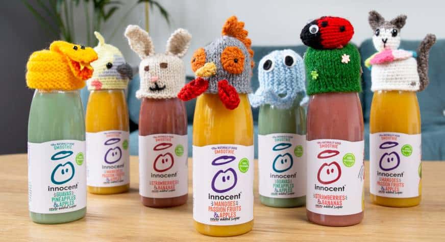
What better way is there to stand out on shelf and raise money at the same time, which is exactly what Innocent have done over the years with their little hats initiative.
Pringles
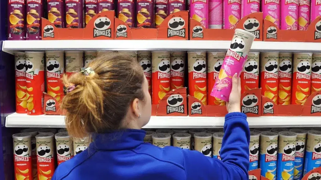
Once you pop you just can’t stop. Pringles have led the way in the chips/crisps/snacks category with their unique packaging (although now copied), mascot, ad slogans and even the chip conformity. While not afraid to evolve their branding over the years, Pringles have been careful in not making too drastic changes.
The DNA Of Distinctive Brands
Inspire your team and brand, by understanding how to achieve greater levels of distinctiveness with our guide to Distinctive Brand Assets
Hrum&Hrum (Concept Design)
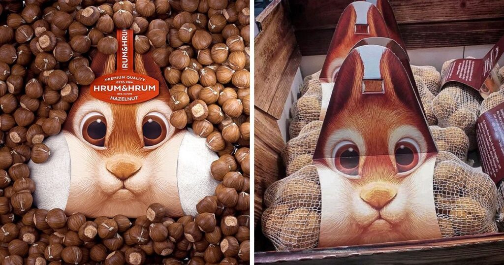
Unfortunately just a concept design, it deserves inclusion as exactly what every new product should strive for, something which just stands out on shelf!
Cadbury
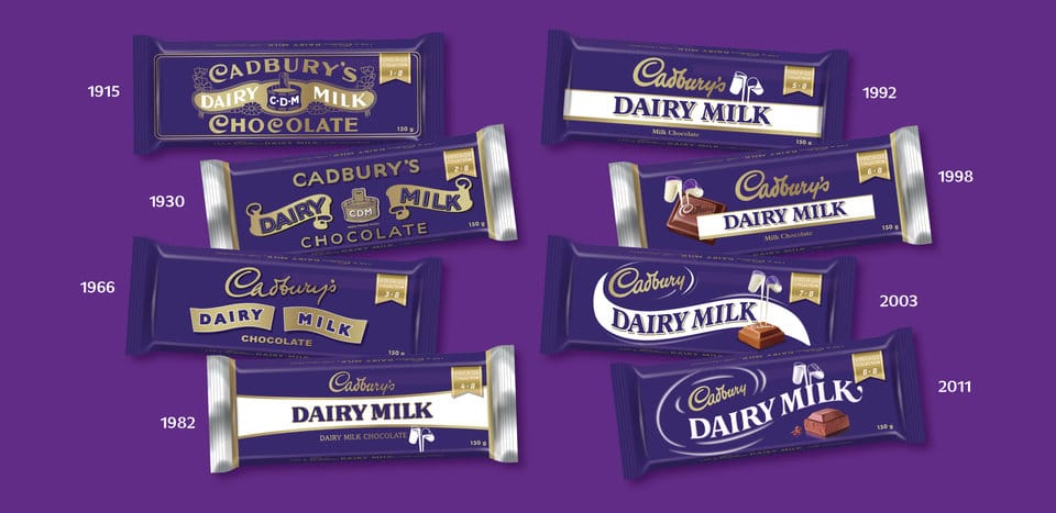
The Cadbury purple is an incredibly hard-working asset for the brand. Consistency over the years along with a distinctive pack range strategy has allowed Cadbury become synonymous in several countries for chocolate. While not distinctive from a shape or feature perspective, it deserves a place on this list for its consistency and ruthlessness over time.
Милград (Milgrad)
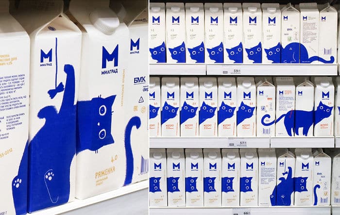
One of the best product designs of recent years, this clever concept turned mundane milk packaging into something fun, versatile and distinctive.
Coca-Cola
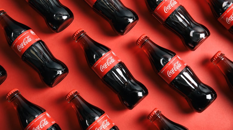
1916, Coca-Cola decided its glass bottle was not distinctive enough, and thus the contoured version we know and love was born, then trademarked in 1977 to subdue copycat brands.
Coca-Cola is a masterclass in best packaging design, utilising a consistent shape, colour scheme and font. While the brand iterates playfully, such as with their ‘Share a Coke’ campaign in which common names were added to bottles, the elements which make Coca-Cola packaging so instantly recognisable are retained.
Jif Lemon Juice
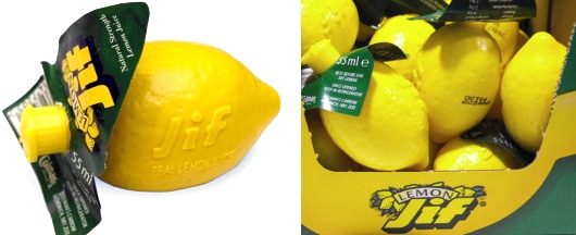
What might seem obvious now, Jif was creating Distinctive Brand Assets before the concept & theory was even formalised in the minds of marketers, when they introduced the plastic product in the 50’s. Up to then, their juices were normally sold in glass bottles, until Jif created its highly distinctive package which has stood the test of time.
Tiffany & Co. Box

The iconic Tiffany & Co box is a much revered asset, much down to the consistency of use over the years. The “Tiffany Blue” boxes tied with white ribbons, have become a global symbol of luxury and sophistication since first introduced in 1878. It will be interesting to see how much the change in brand strategy impacts the strength of their distinctive packaging and assets in the years to come. Will they evolve the brand whilst maintaining and using the incredible assets they have, or will they get too caught up in the “new” and forget about what has helped them to become the global brand they are today.
Toblerone
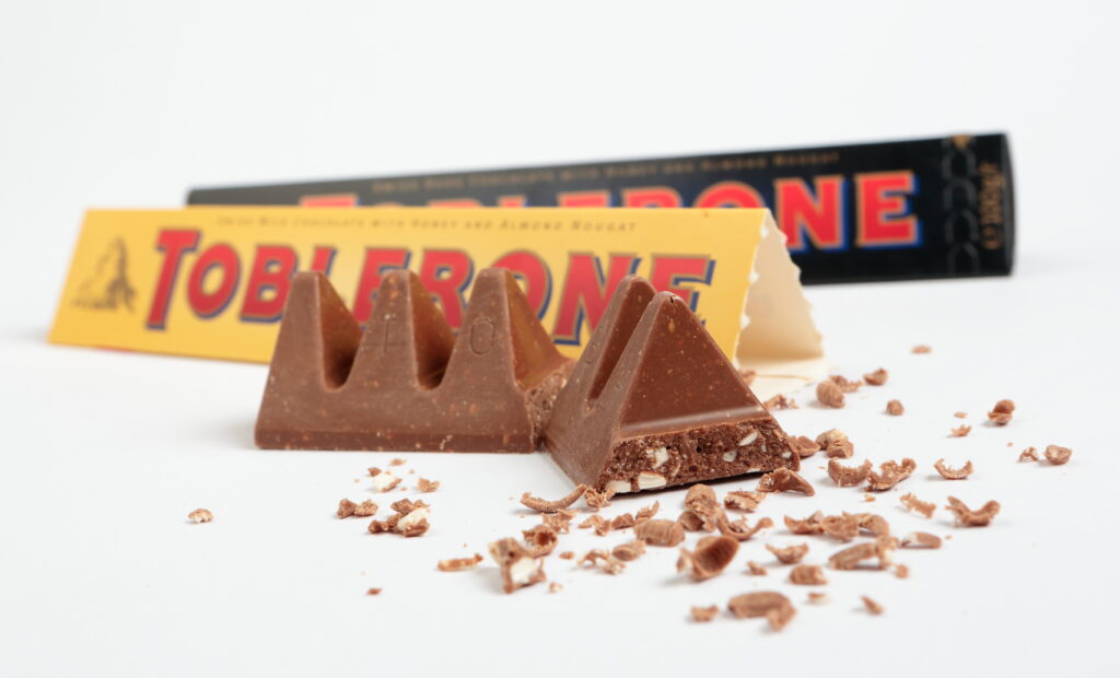
Did you know the Toblerone shape is (supposedly) copied after the awe inspiring Matterhorn Mountain? Neither did we. This is one example of distinctive assets coming from some part of the brand history/origins/heritage, but one must ask does it really matter? The effect of DBAs on driving salience is also of note with Toblerone. Why oh why do we feel the need to buy triangle based chocolate only when in an airport? This is a great example of when DBAs and Category Entry Points combine, two critical areas in marketing science elevated by the great work of Jenni Romaniak and Byron Sharp of the Ehrenberg Bass Institute.
Mastering the art of distinctive packaging is about creating assets that go beyond aesthetics. In a crowded marketplace, Distinctive Brand Assets act as beacons, guiding consumers to your brand amidst the visual cacophony. Cross utilise DBA’s from your wider asset portfolio on your packaging; this will contribute to a compounding effect that fuels long-term memorability.
Learn more about the key factors in creating distinctive packaging here or if you need help running packaging research, get in touch.
Have any questions on Distinctive Brand Asset Research or Tracking? Drop me a message via LinkedIn or email at hello@distinctivebat.com
Distinctive Asset Measurement: Brand Research That Provokes Action

Used by some of the world’s most distinctive & leading brands


