Earning The Right To Go Wide With Distinctive Assets
Earning The Right To Go Wide With Distinctive Assets
A version of this article first appeared in Marketing Week and can be seen here.
There are a number of factors that contribute to the embedding and performance of a distinctive asset or brand code. Time is one, but marketers can’t influence this. Reach (and frequency) is another, driven by the size of the paid media investment, the impact and execution of earned media, and how well the brand uses its owned media via touchpoints like packaging, app icons, storefronts and even delivery drivers. Prioritisation and consistency are other closely related factors that contribute to distinctive asset performance over which marketers have control. Being ruthlessly consistent with only a few assets is often all that is needed to create a distinctive brand.
Asset type also has a major input. Some asset types, like characters or jingles, perform better than others. Incongruity is often in the DNA of a strong distinctive asset. If it inherently stands out, it has a massive leg up.
And this leaves creativity. When all else is said and done, how a brand plays with their distinctive assets, and how creative this is, will have a significant impact on how well an asset performs in the distinctiveness stakes. While all brands can and should play with their brand codes, the level to which they can be flexed is dependent on how well-embedded they are in the first place.
A recent Mark Ritson Marketing Week article got us thinking on this very point, and it aligns with common questions our clients pose when conducting Distinctive Brand Asset research with us. Can we create an alternative version of the character? Is the pack shape embedded enough for us to play around with colour? Is the ad style attributed to us at high enough levels yet to create variations? Can we reduce the size of the logo to give more prominence to X?
Ritson is rightfully supportive of the need to “fuck around” with brand codes, but he is also very conscious that this can also be overplayed if the brand code is not embedded enough.
“You need 40 fascist years of consistency first. But, once you have that signature, that salience, that centricity, that familiarity, you are probably also a little dusty. And that is the exact right time to use your familiarity to fix your over-familiarity by fucking around with your brand codes. Ignore the monochrome manual that says thou shalt always make everything super-obvious and didactic. Sure, do that. But occasionally don’t. Be playful.” Mark Ritson.
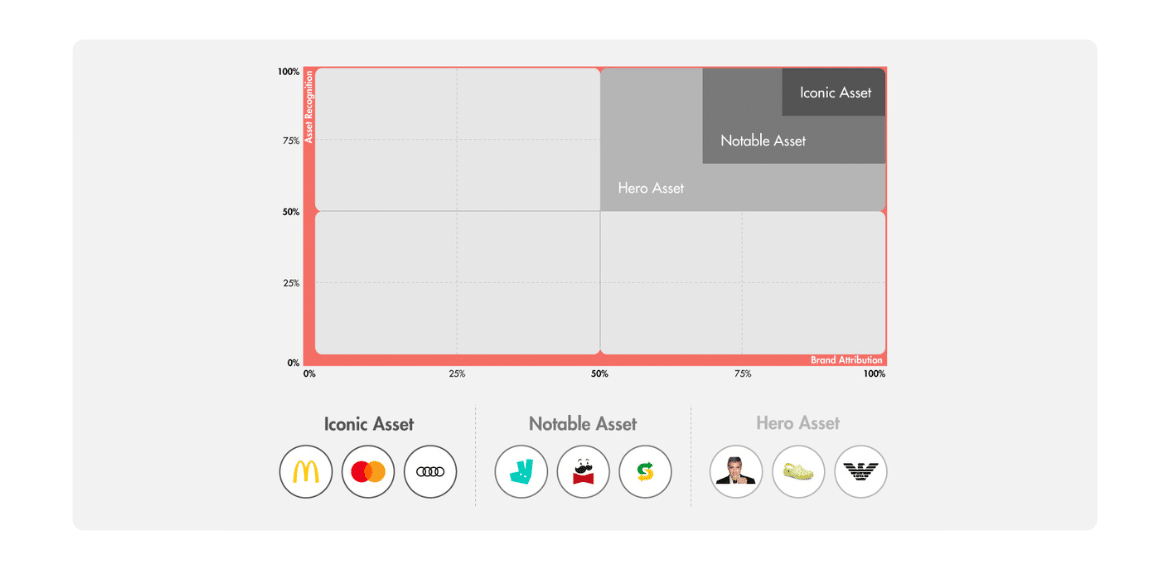
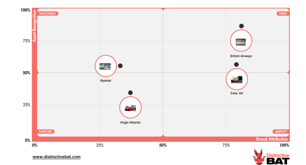
Our guidance is very much data-driven. We quantify asset performance across distinctive metrics derived from Distinctive Brand Asset research to determine how much an asset can be flexed and stretched. In a nutshell, if it appears in the top box quadrant, where at least 50% of people recognise the asset and at least 50% can attribute it spontaneously to the correct brand, there is more of a licence to stretch said asset. An important caveat, this is across a sample of light category buyers. If it only performs well amongst category enthusiasts (think motorheads, whiskey geeks, or fitness fanatics, for example), then you’re only codding yourself that an asset is embedded.
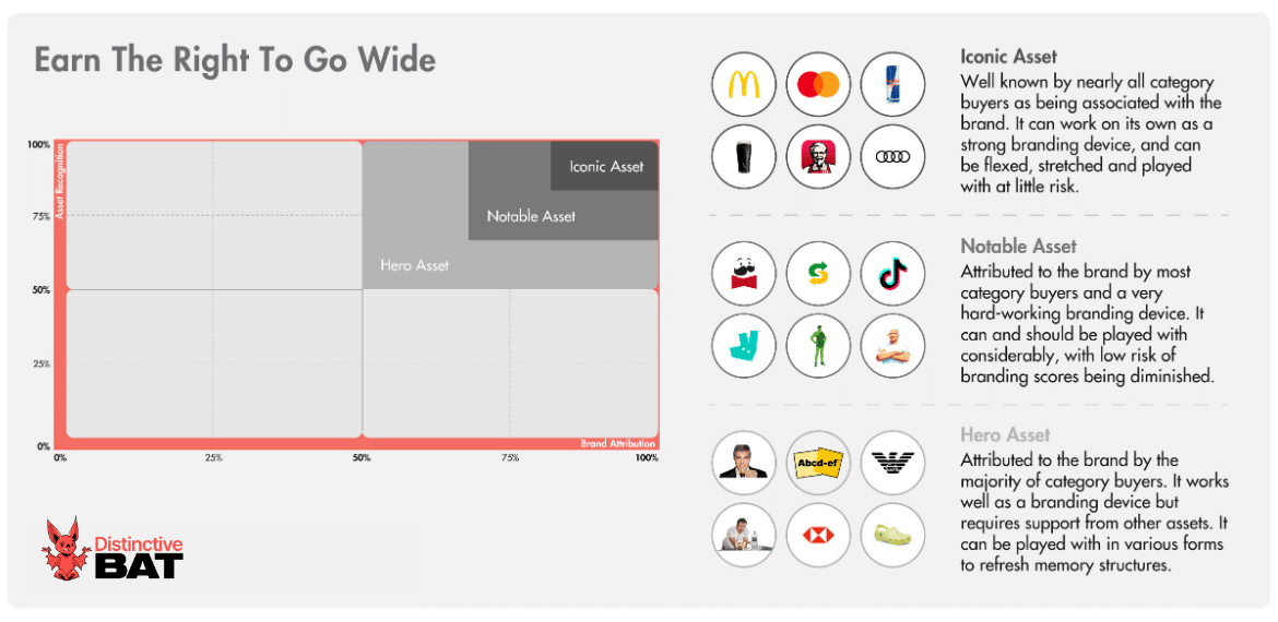
Guidance overview using a distinctive asset grid, first created by Jenni Romaniuk & the EBI.
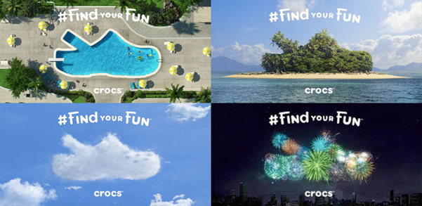
Take Crocs, for example; Their product shape is well embedded as a distinctive asset with a good majority of category buyers, we’d classify it as a hero asset for sure. They are able to play with this shape in advertising to great effect, without the need only to feature the shoe which is their main distinctive asset. This playful twist on the Croc entices consumers to fill in the gap, further cementing the shape as a Distinctive Brand Asset. To quote Hector Hugh Munro, “In baiting a mouse trap with cheese, always leave room for the mouse.”
HSBC is another example of a brand that has done so well at embedding an asset, with their red icon, it can now be the lead in their advertising. This is especially useful for a brand that leans heavily into OOH advertising (including airports) where the logo often gets lost or ignored.

(Credit/source: Marketing Week)
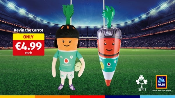
When distinctive assets start nudging their way towards the top right corner, the ability to play and stretch the asset grows. Aldi has used their Kevin the Carrot character very well, predominantly as part of their Christmas advertising. Kevin is notably embedded, so Aldi can stretch this asset, including dressing him up in different guises and introducing new family members which even appear in the real world as collectable stuffies.

They can also quite easily take him out of the Christmas context, such is his strength, and have started using him in other ways, for example, as part of their Irish Rugby sponsorship activation.
Distinctive Asset Measurement: Brand Research That Provokes Action
Used by some of the world’s most distinctive & leading brands


This isn’t to say that once an asset is well embedded, the rulebook goes out the window. Play with some assets too much and you mess with consumers memory structures. Take Peugeot for example. We tested their new and old logo as part of our research into the debranding phenomenon, and scores were substantially diminished for the new version of the logo, which was a stretch too far. This shows that if you change an asset too much, and it happens to be the focal point of your advertising, consumers may miss a trick and not associate said piece of advertising with your brand.
Another common issue is when brands introduce too soon, or too many iterations of an asset before it’s even embedded. This is quite common when it comes to characters, where new family members are introduced, or the asset is played with too much that it becomes unrecognisable. We often see this when characters are used on packs, and a different version of the character “family” might be utilised for each SKU. Even when the art direction is similar, this causes too much dilution, and it becomes difficult to embed the asset(s).
Alpha-Bits provides a cautionary tale to this effect. The discontinued U.S. cereal brand had numerous on pack characters over the years. This lack of focus and consistency makes it difficult to make a distinctive asset stick. The same can not be said for Tony the Tiger et al.
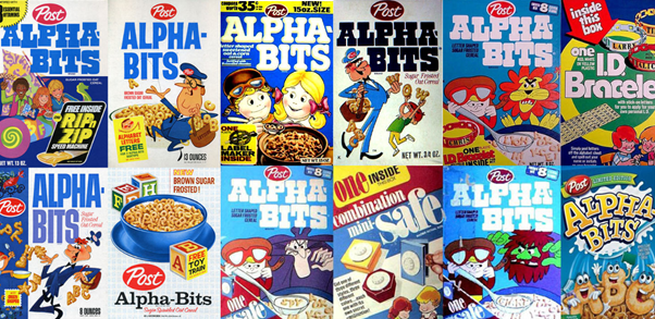
(Source: Mrbreakfast.com)
Then, there are some assets which need no introduction. These are the iconic brand assets of the world, where the vast majority of category buyers recognise the asset and can attribute it back to the brand (circa. 85%+ recognition and brand attribution). These assets can work on their own as a strong branding device without the brand name present or overtly in focus, and can be flexed, stretched and played with at little risk. If anything, the alteration or augmentation of the asset refreshes memory structures further.
A recent Dominos campaign in New Zealand is a good example of an iconic asset that can lead the charge even without the brand name present.

The new British Airways campaign by Uncommon has also seen lots of conversation within marketing circles for its starkness, with no CTA or full logo in sight. However, in light of the equity built up in assets such as colour and font, along with the brand name hint, the large majority of consumers can still easily attribute it back to the correct brand.
Specsavers have built up such strength in their tagline and platform, “Should Have Gone To Specsavers”, that they can run subtle takes on this to great effect, including their recent stunt, which went viral on social media. With the van stuck on a bollard, the tagline instantly came to mind as it appeared in newsfeeds. With the tagline not even present, it caused some confusion as to whether it was real or fake, further helping to increase earned reach. It’s safe to say if the brand had left a sign of some sort with the tagline, it wouldn’t have seen nearly as much traction.
The DNA Of Distinctive Brands
Inspire your team and brand, by understanding how to achieve greater levels of distinctiveness with our guide to Distinctive Brand Assets

Guinness, meanwhile, is renowned for effectively incorporating the shape and colour of the pint into disruptive and attention-grabbing advertising. The pint serves as a simple yet incredibly adaptable device that forms the foundation of the brand’s success.
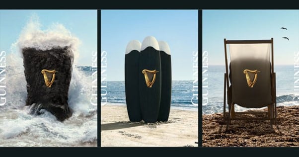
Once an asset achieves iconic status, the brand gains an unfair advantage in its ability to creatively leverage and stretch the asset for significant impact. The strength of the asset allows it to be strengthened even further in playful use.
If your brand is at this point, lucky you. You’re likely basking in the shade of a tree planted and nurtured by the brand team’s past.
But if your brand is not quite there, you need to put in the hard yards first by doing the fundamentals well, being ruthless in application, and driving consistency across touchpoints. There will still always be room for creativity, of course, and with guardrails in place and your distinctive assets front and centre in any brief, you and your agency can still create some magic.

Have any questions on Distinctive Brand Asset Research or Tracking? Drop me a message via LinkedIn or email at hello@distinctivebat.com
Distinctive Asset Measurement: Brand Research That Provokes Action
Used by some of the world’s most distinctive & leading brands