Key Factors in Distinctive Packaging Design
Key Factors in Distinctive Packaging Design
A distinctive pack is a brand growth multiplier. Get it right, and you can drastically improve your chances of success. It can contribute to a brand on so many levels.
- Shelf stand out – Being easy to find is critical for FMCG/CPG brands. For newer brands this means standing out from the clutter to grab the attention of prospective shoppers. This could be through the use of a distinctive element on the pack or, indeed, stepping a few degrees away from category norms in order to be noticeable. For established brands, it means being easy to spot with little effort to ensure your product is added to the basket.
- Branding device – A pack can go a long way in ensuring your advertising is undeniably you. It aids branding scores and is a flexible device that can be used in multiple ways to drive advertising ROI. It can also be a key branding device in earned activations, whether PR or influencer-led.
- Free media – A pack is a key-owned touchpoint that simply helps to remind people the brand exists. Whether it lives in the cupboard, the fridge, on a countertop or in someone’s hand walking down the street, these millions and billions of “impressions” all add up. The more distinctive it is, the harder working it will be.
- Memory structures – Distinctive packaging can support mental availability, adding layers to brand memory, ensuring your brand comes to mind at purchase or consumption occasions.
- Range growth – Having a distinctive pack that can be flexed consistently allows you to launch new SKUs much more easily and to grow the range within and outside the category.
All these factors can work together in glorious synergy, with a compounding effect to help grow the brand. It’s no wonder packaging is given the love and attention it requires. But what are the key considerations to be conscious of to improve your pack’s distinctiveness?
1) Elevate
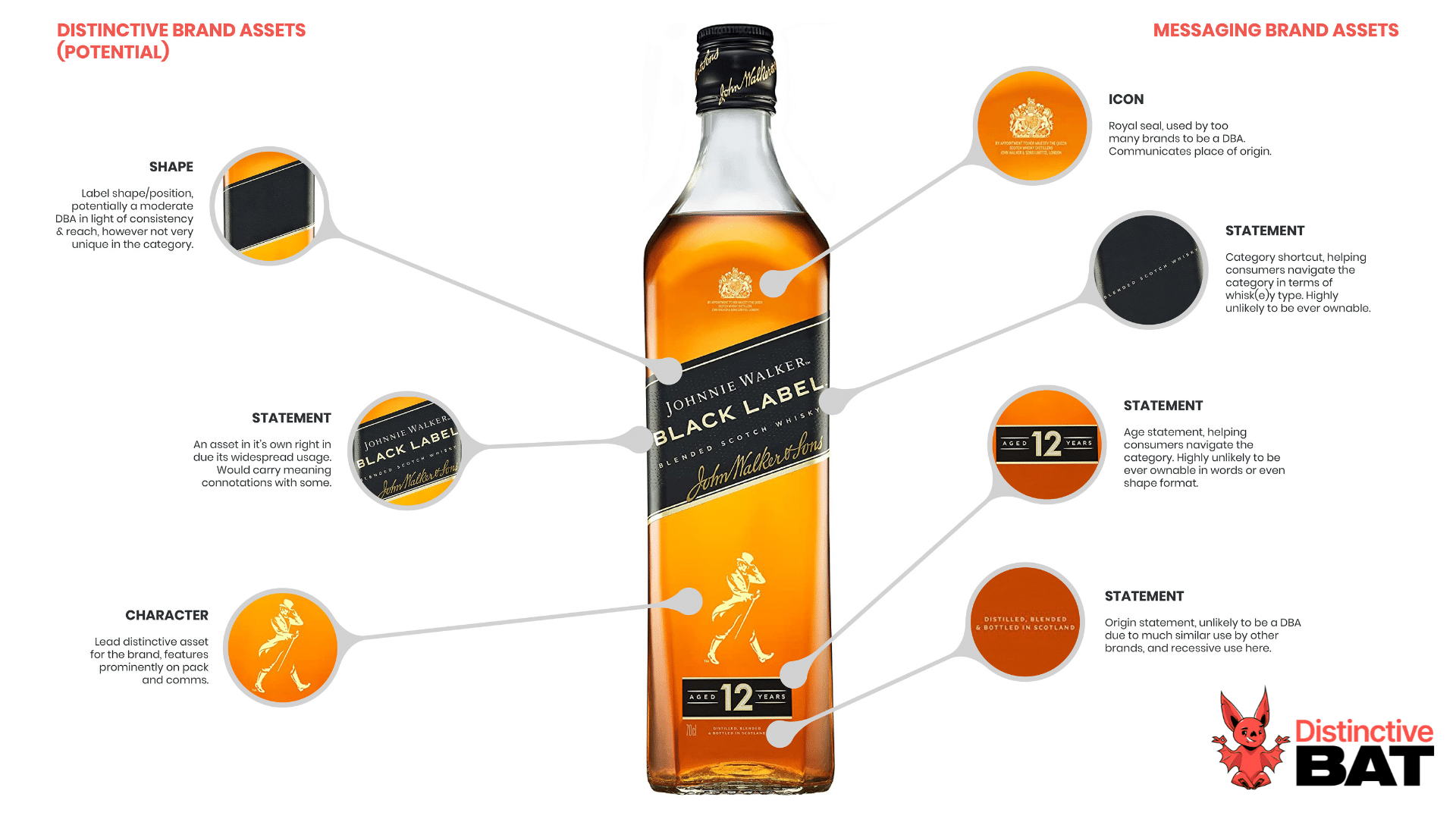
For any FMCG/CPG brand, a pack update should not be approached blindly. It’s critical to understand what elements of your pack aid distinctiveness; that is, what brand assets are being used by consumers to recognise your packaging and are undoubtedly you. Is colour the key? Does your pack have an ownable shape? Is there a specific on-pack element or combination of elements doing the heavy lifting? By knowing these, you can elevate them on pack.
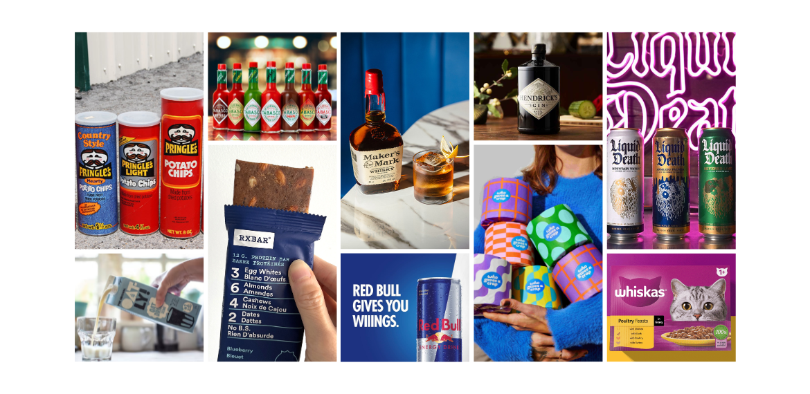
Looking at Pringles, we can bring to life some of the key elements that are driving distinctiveness, and what consumers recognise for the brand. It’s clear to see that shape is one of the biggest drivers for Pringles, the greyscale naked pack in itself is a distinctive asset. When we look at the uplifts versus the red variant, we can see colour isn’t a defining feature, with only small lifts. We can also see that both the logo lock-up and product contribute nearly identically in driving distinctiveness scores up, by a similar uplift versus the red stripped back pack. It’s when both these elements combine we see an iconic pack where the vast majority of consumers are able to attribute it correctly to the brand.
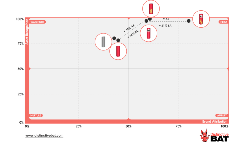
Sample of 300 18-50YO U.S. Consumers
Reviewing old iterations of the pack, we can see how Pringles has evolved over the years and elevated what is distinctive and important to them. Shape has been an ever-constant; this was and still is the key branding ingredient. Then we have the logo, which has been simplified to its current guise, while the product has also been given greater prominence.
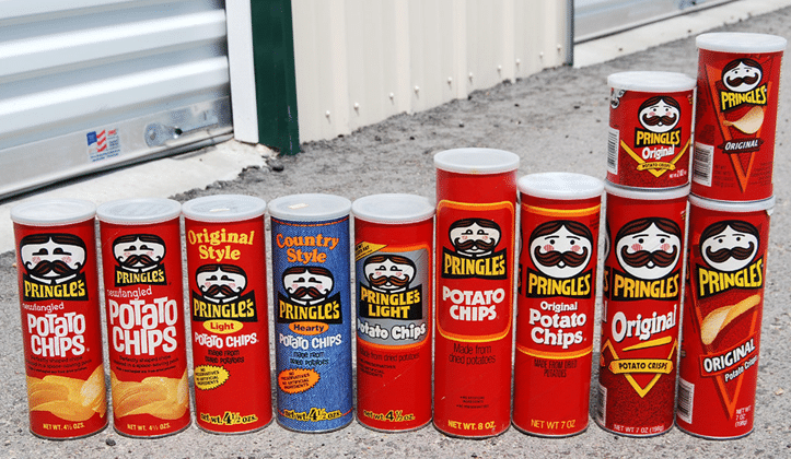
Source: Roadsidepictures on Flikr
2) Deprioritize
As we can also see with the current Pringles pack compared to older iterations, other elements have been dialled back to allow their key brand assets space to breathe. By understanding which brand assets are playing less of a distinctiveness role, you can make more informed decisions about any pack redesign or update.
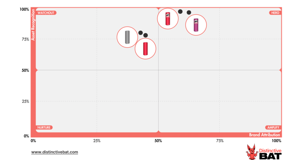
With Pringles, we can see that with shape doing much heavy lifting, colour isn’t critical. This can be seen in the marginal lifts between the greyscale pack and the red pack. We can also see marginal differences between the main SKU for Pringles in red and another variant in purple. This opens up Pringles to be flexible in their approach to colour, using it to help distinguish between SKUs and flavours. If all equity was held up in red, this would limit the brand, which is often a challenge for those who use colours as codes to distinguish variants (e.g. full fat and low fat).
When working with clients to understand what is distinctive about their pack, we include multiple versions with different elements removed or added to test what is important (or not). We also triangulate the results by testing the assets in isolation.
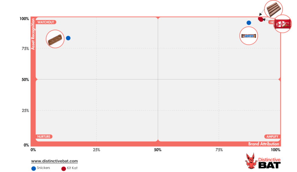
Looking at some well-known chocolate brands, we can see that product is a key asset for KitKat, with strong equity in their four-finger product, but much less so for Snickers who don’t need to lean on this asset on their pack, allowing the focus go elsewhere.
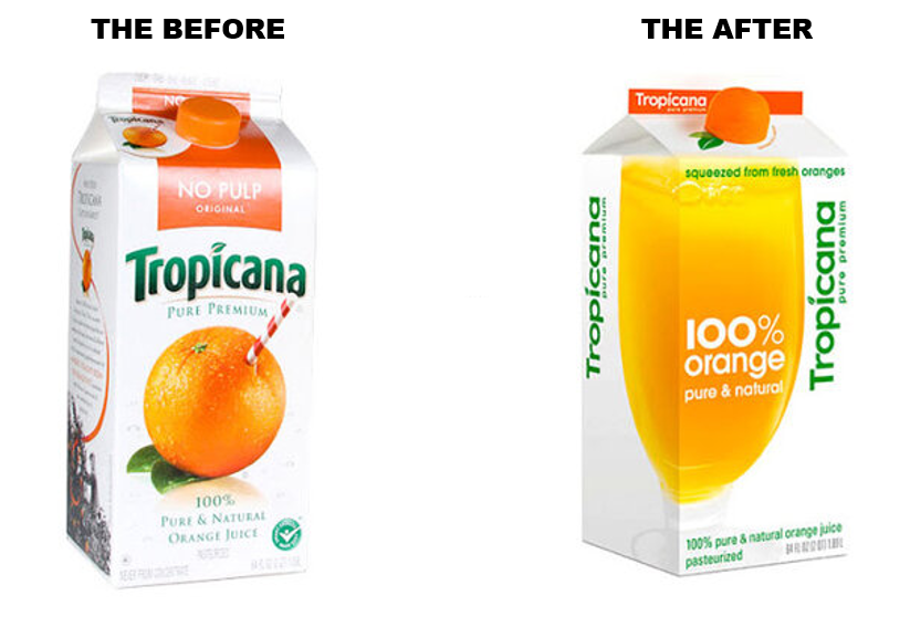
By understanding what assets to deprioritise, you can avoid making costly mistakes by removing or dialling back what makes your brand you in the first place. If Tropicana had researched their pack before their infamous and costly update, they would have been clear on what they should have kept.
N.B. It’s very important to be clear on the roles of certain assets. Some, while they might not be distinctive or ownable, could be playing a category code role, helping people navigate the category. Think of how a cow would signal “real” milk in the dairy category across many segments. This is why brand asset research can be so important, ensuring you are clear on the role of different assets and codes for your brand. Some might be playing a distinctiveness role, and some might be playing more of a differentiation role.
It is critical that you know what you can and cannot deprioritise as part of any pack update.
Distinctive Asset Measurement: Brand Research That Provokes Action
Used by some of the world’s most distinctive & leading brands


3) Unify
With innovation playing a key role in satisfying new consumer tastes and occasions, as well as satisfying the revenue needs of those upstairs, innovation is a constant for many consumer brands. With multiple benefits, including helping to increase shelf presence through multiple products, range architecture is an important consideration in how the brand flexes between SKUs. So often, innovation can sit separately from the core brand/marketing team, which, along with a lack of guardrails in how a new innovation comes to market, causes many brands to end up with a hodgepodge of SKUs and products over time. Twinings is a good example of this, lots of disparate flavours launched over the years with only the logo lockup connecting the range. This was consolidated through a range refresh in recent years to ensure clarity on the connecting distinctive assets used across each pack, with the roundel device being a key common denominator.
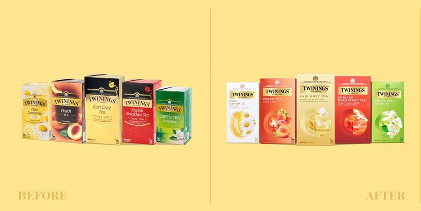
Source: Agency: Butterfly Cannon via Packaging Of The World
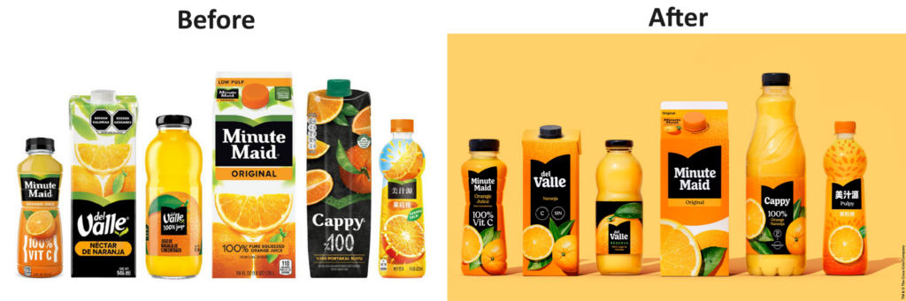
One of the most important things an FMCG brand can do is to have absolute clarity on what distinctive assets are consistently used across each SKU, ensuring a common design system for how any new innovations or formats are rolled out. With common distinctive assets, you have a much better chance of them being embedded; trying to embed a DBA at a SKU level is a next-to-impossible task for the majority of brands with dilution of reach. Minute Maid is another example of a brand that unified their range across SKUs and across markets, with the results clear to see.
Looking at Tabasco, we can see the assets with equity, which informs their design system. There is decent equity in the naked bottle alone (colour and greyscale); however, we see good uplifts with the diamond label, and even more again when the red cap and green neck label are added. These are the key assets to be used across all products, with compounding in place so each variant contributes at a master brand level to embed the bottle and individual distinctive assets.
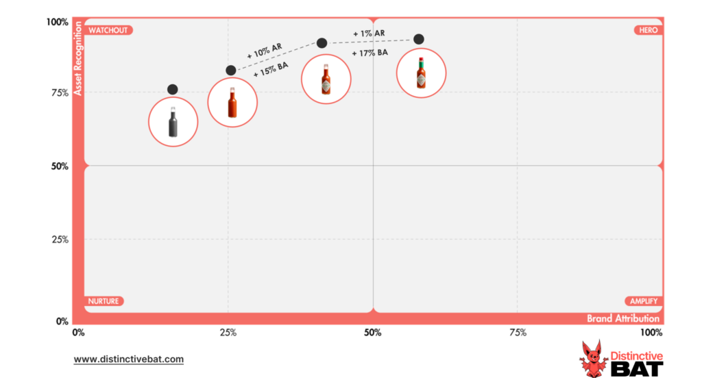
Note: Sample of 300 18-50YOs in the U.S. Sample is national representation and not hot sauce buyers only, hence lower than expected scores for Tabasco.
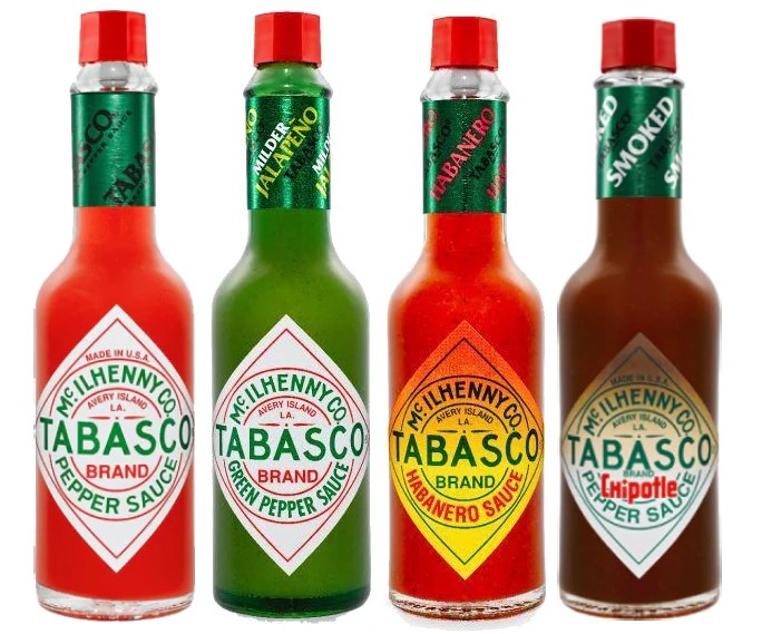
With the brand not completely reliant on colour, it can flex a little there in terms of different shades or colours, like green for jalapeno. Once the key distinctive assets are used, there is little fear of a hot sauce buyer not knowing it’s Tabasco. And when these guardrails are in place, it is clear when they can flex SKUs so they are distinguishable. This is important; a balance is needed between range uniformity and having enough visual cues to distinguish each SKU, playing up to the reason for the SKU in the first place, e.g. flavour, format, dietary needs, etc.
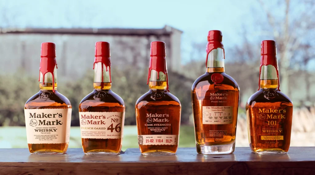
Maker’s Mark is a brand we love for how uniform their range is. While shape, colour etc are similar it’s the red wax top that is the key range unifier. Très magnifique.
The DNA Of Distinctive Brands
Inspire your team and brand, by understanding how to achieve greater levels of distinctiveness with our guide to Distinctive Brand Assets

4) Amplify
Pack refreshes can often be done in isolation, with the key brand assets not being carried through to other touchpoints and, in the main, not being prominent enough in advertising. This is a missed trick. It takes time, creativity and reach to really embed a distinctive asset, and if you’re not using all your touchpoints, you can make the job much, much harder.
Red Bull has a number of strong assets. Looking at the below DBA pack research, their colour swatch has good equity, as seen from the uplifts versus the naked can.
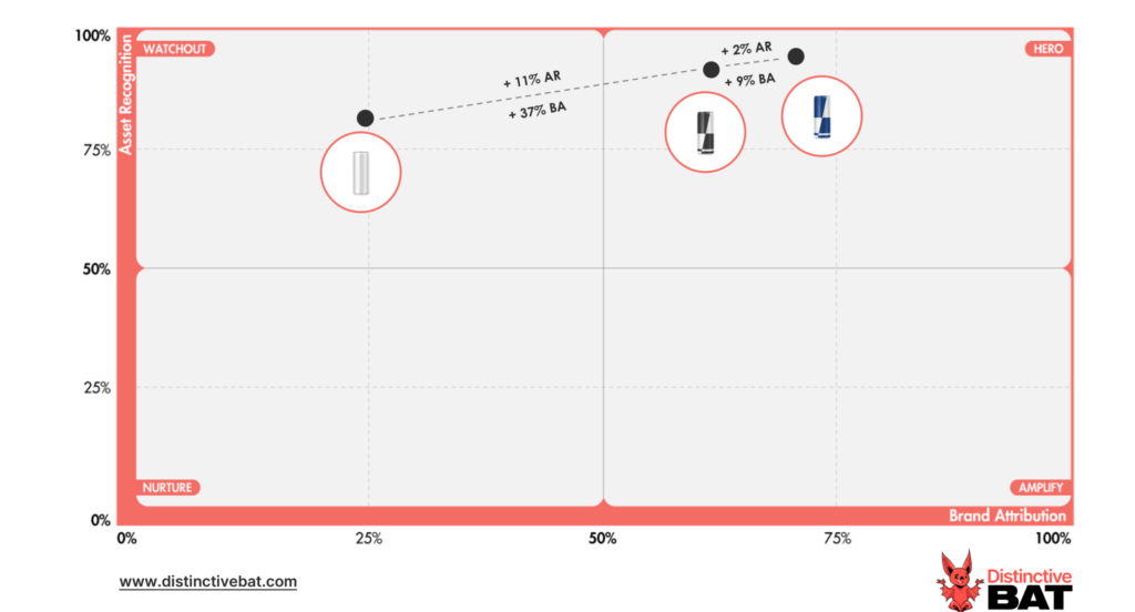
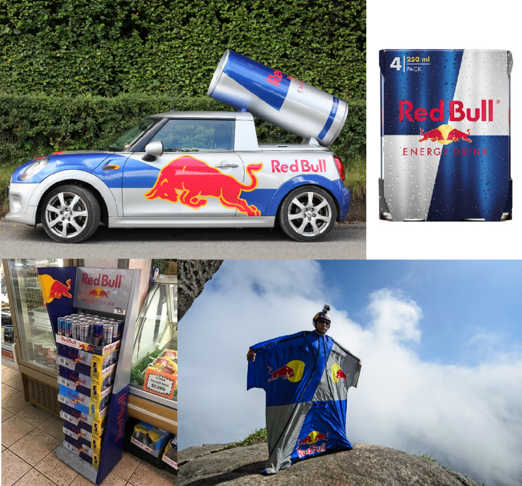
This is very much a Red Bull distinctive asset, and the brand leans on this across other touchpoints to continue to embed it (while also seeing the benefits when used on other touchpoints due to the current ownership levels).
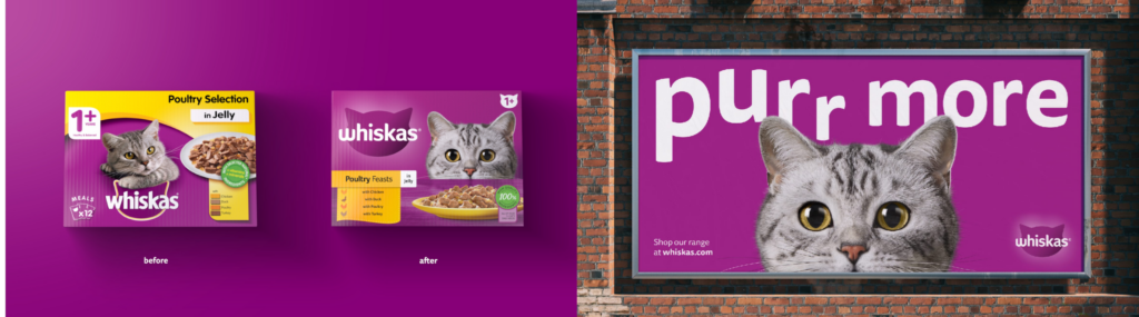
The recent Whiskas refresh is a masterclass in ensuring key pack assets are amplified elsewhere. The logo, cat silhouette, and colour all live prominently in advertising. This might seem super obvious to most, but it’s not always done.
5) Circumvent
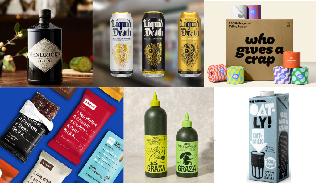
Circumventing the category packaging norms is a tried and tested approach that has been the success behind many brands; in several cases, brand growth is very much driven by distinctive packaging. While normally a tactic employed by new brands with no history to worry about, Oatly and RxBar show that any legacy brand can disrupt the category through distinctive packaging. DBA research can be quite powerful in aiding this, for new or current brands, by helping to show the category codes to beware of and also in testing new packaging or assets to understand if they feel too generic to the category.
Like anything in marketing and life, balance is key. There are certain rules you may still need to abide by from a category code POV to fit in while standing out, along with other more functional considerations in terms of logistics or even how you are stacked on a shelf.
If you need help understanding what is distinctive about your packaging, reach out to us here.

Have any questions on Distinctive Brand Asset Research or Tracking? Drop me a message via LinkedIn or email at hello@distinctivebat.com
Distinctive Asset Measurement: Brand Research That Provokes Action
Used by some of the world’s most distinctive & leading brands